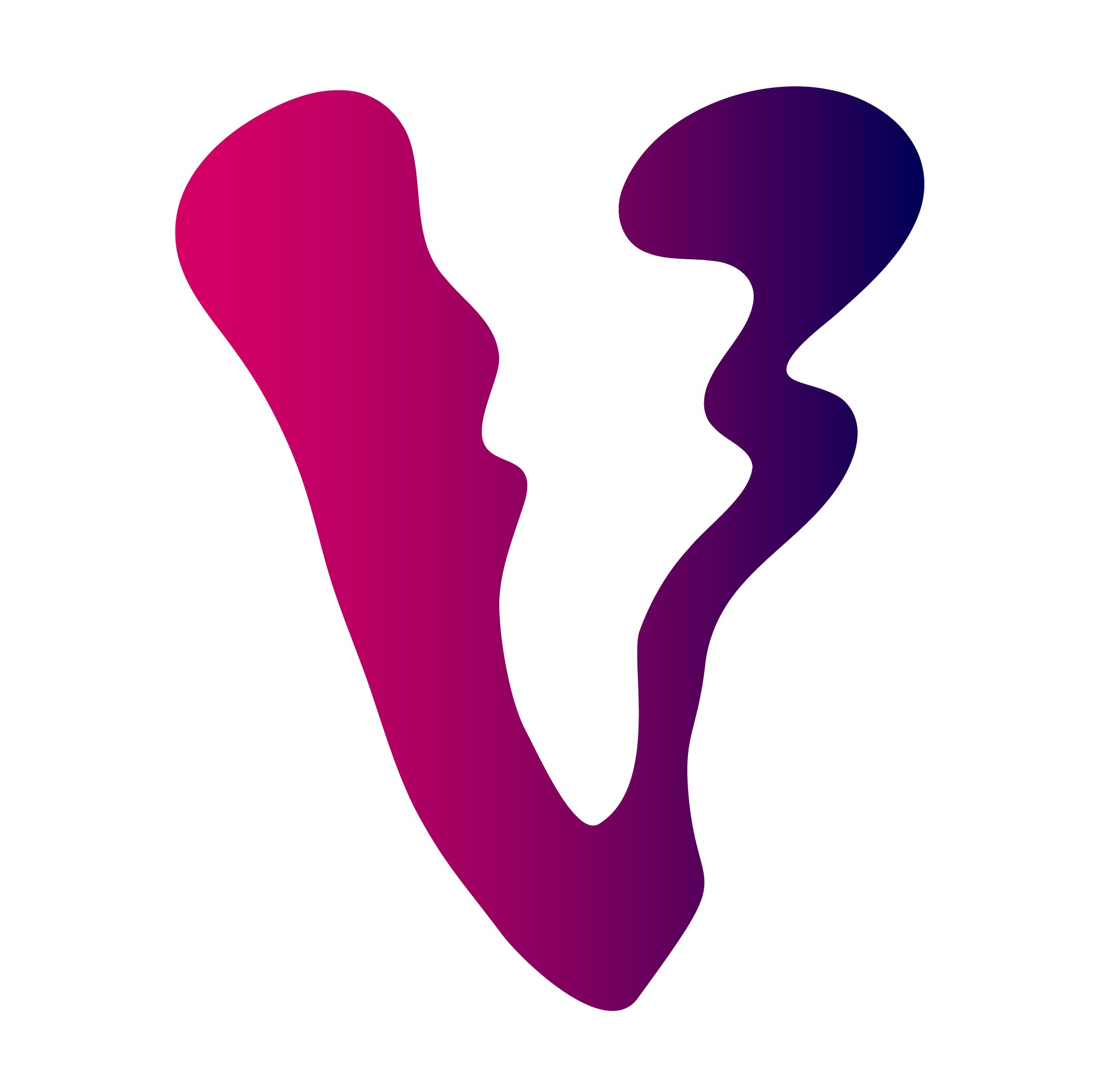
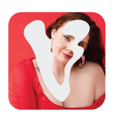
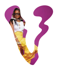
My client came to me needing a mark she could carry into the world — a public debut, with a feature article set to publish in just three weeks, giving us a firm timeline to design against. What she wanted was something that captured her duality: the push and pull between polish and instinct, structure and spontaneity. The result is a fluid, molten 'V' — the anchor of a full identity system now taking shape, soon to be joined by a website and branding photoshoot.
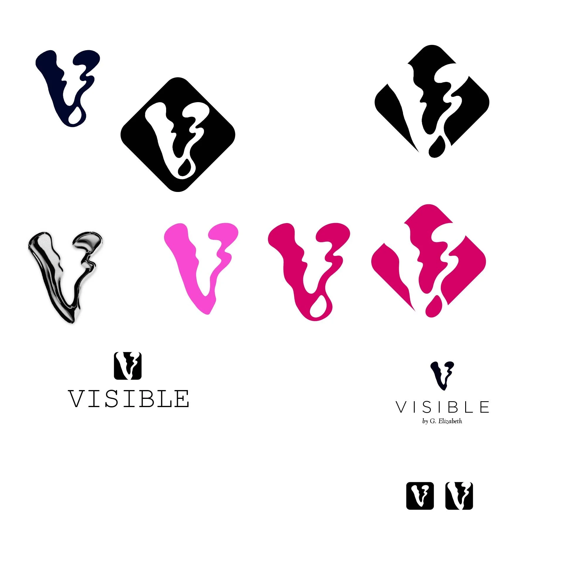
At its heart, the liquid V speaks to a refusal to be contained — a symbol of forging one's own path rather than settling into someone else's mold. It's balanced by a clean sans serif, lending the mark structure amid its fluidity — contrast made tangible, exactly as she envisioned it. A subtle shadow cast across the primary logo nods to the visibility concept woven throughout: the tension between what's seen and unseen, present and hidden.
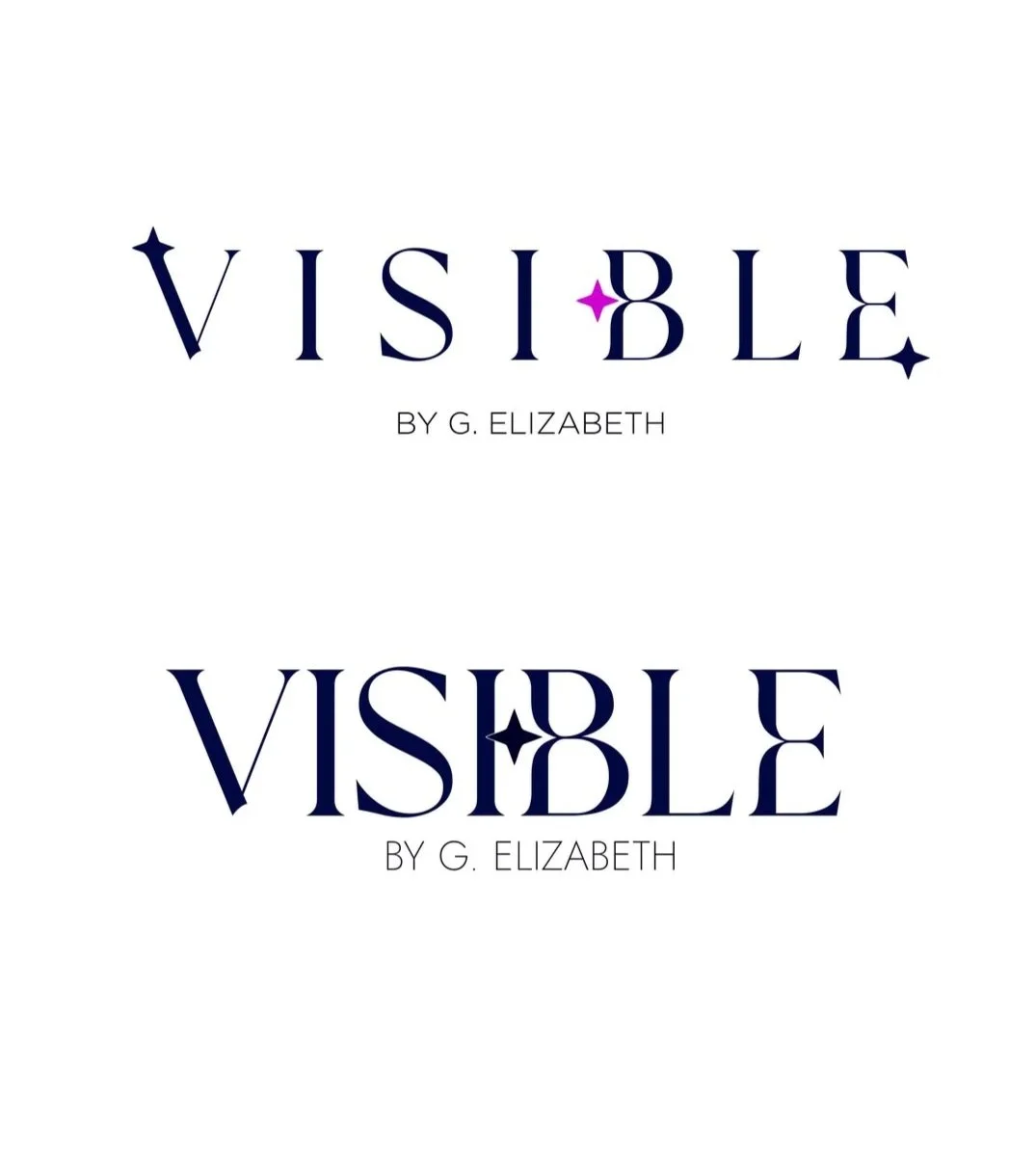
VISIBLE by G. Elizabeth
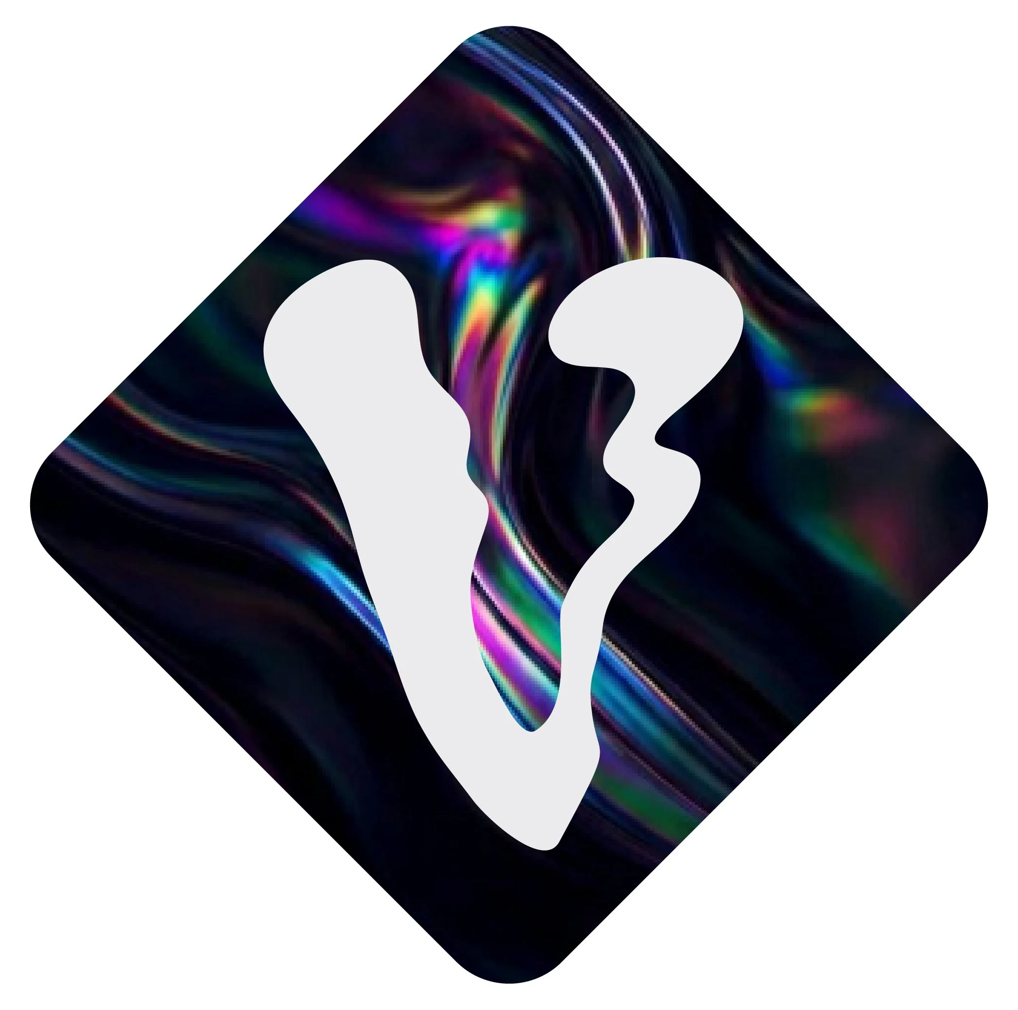
The molten “V” is the brand's signature symbol — built to stand alone as an avatar, favicon or emblem, and to hold its shape across endless creative treatments: masked into photography, stamped over images, cut out of gradients and patterns.
the mark
color
A dark navy anchor, a warm neutral, and a pink-to-purple-to-blue signature gradient.
GRAY / WHITE
NEON PURPLE
BRIGHT PINK
BLUE
DARK NAVY

SIGNATURE GRADIENT

concept usage

process
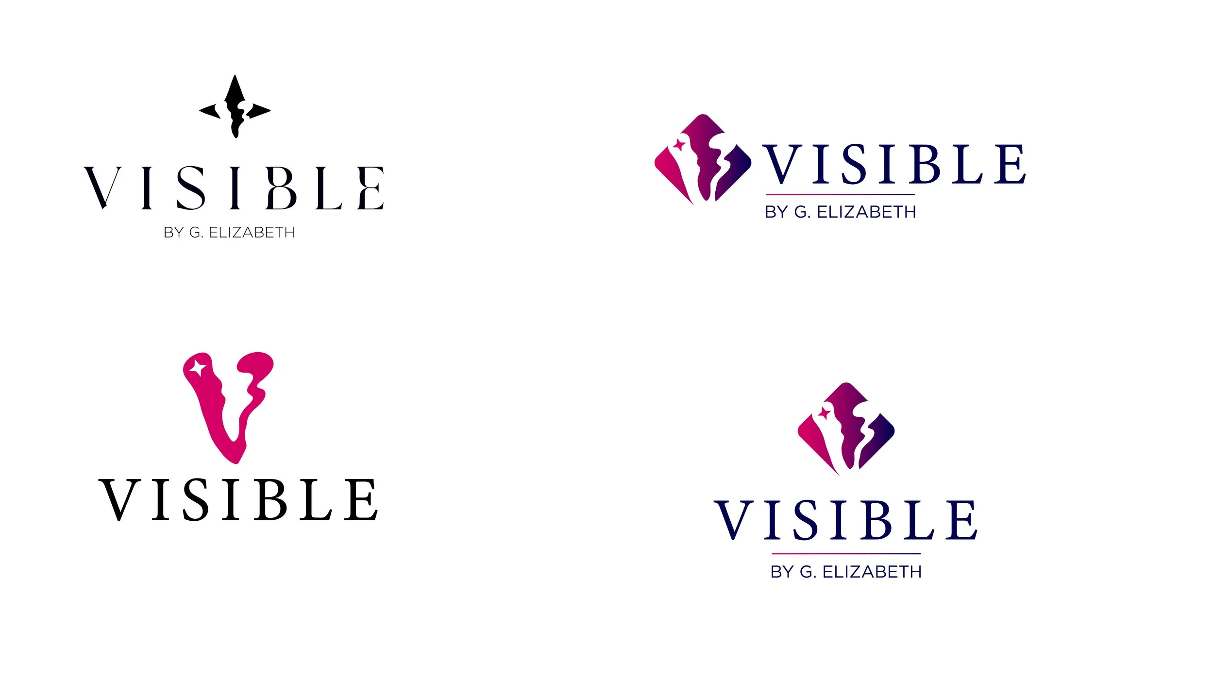
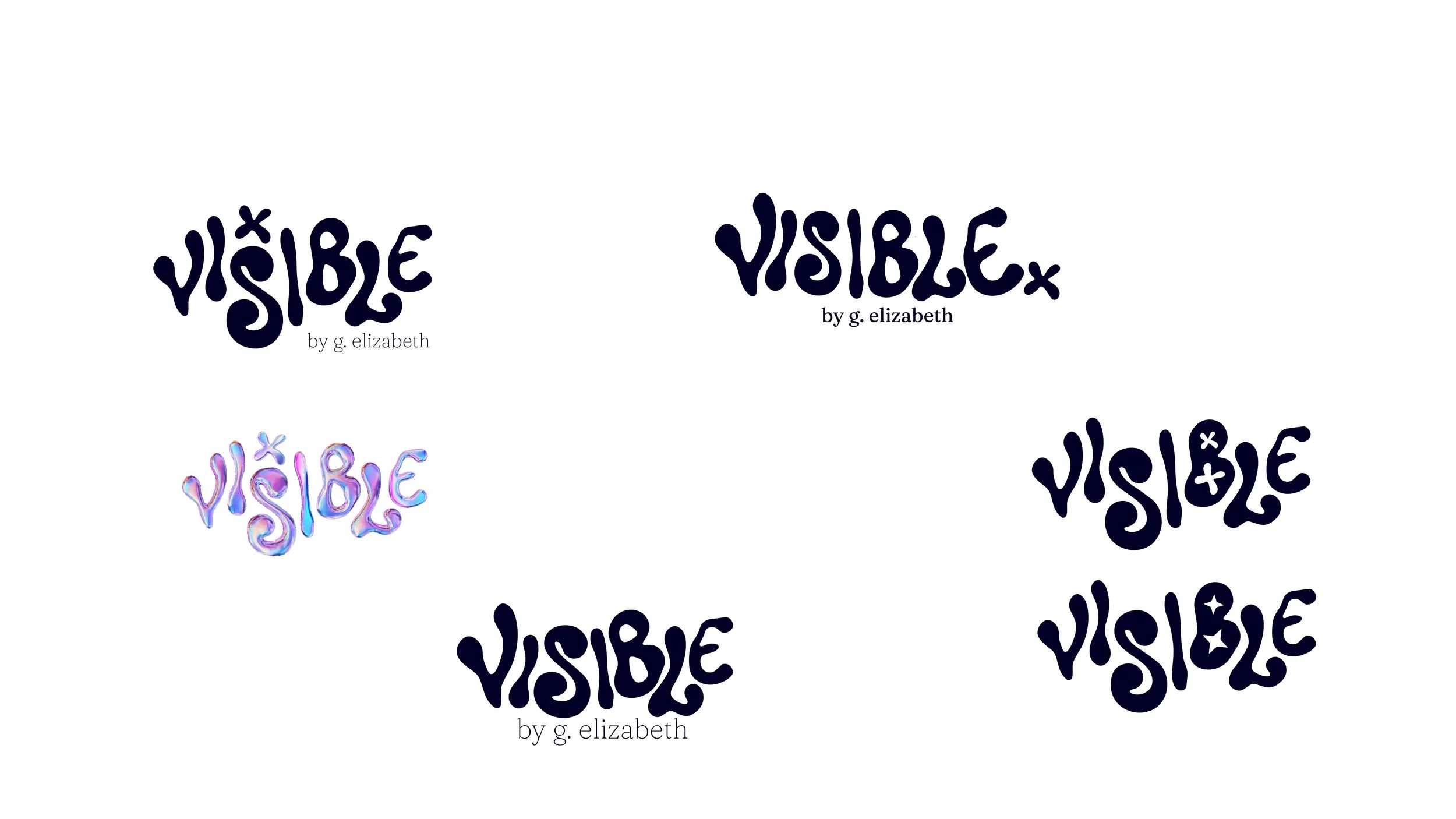
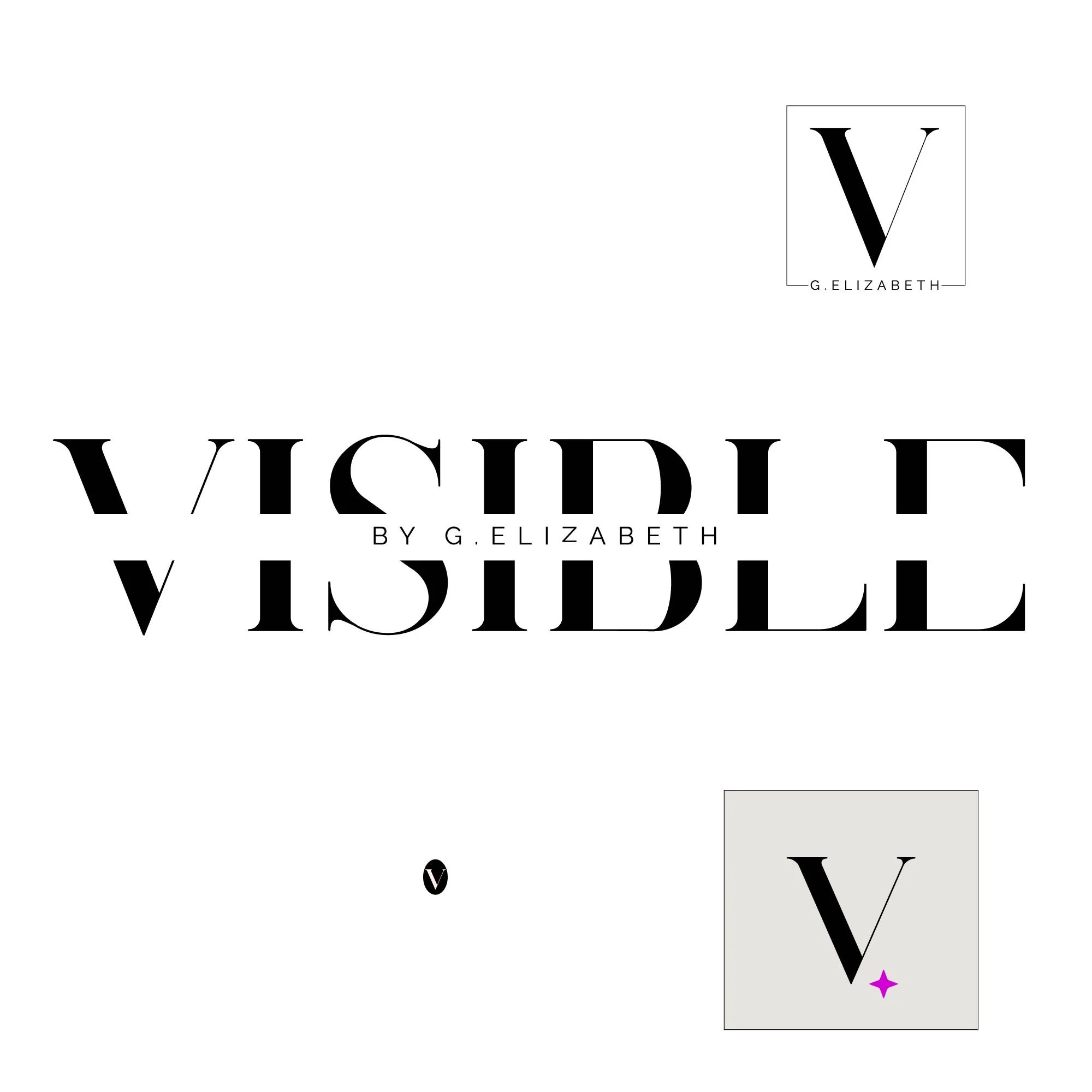
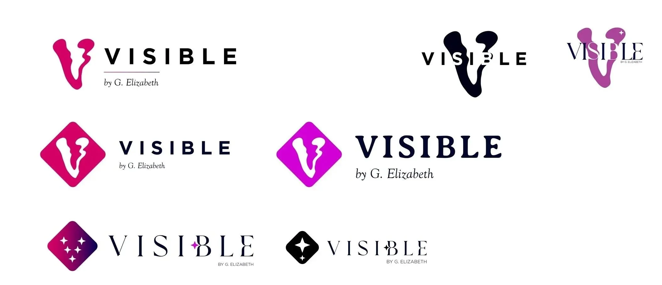
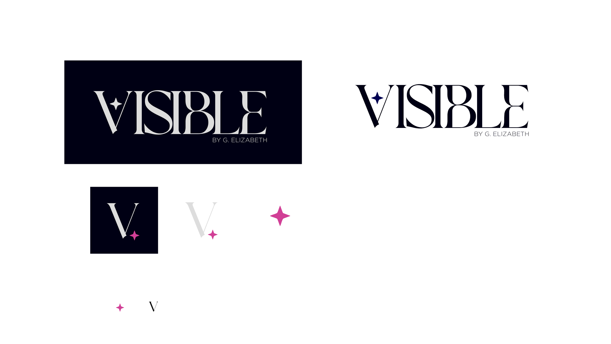
Early sketches and iterations. I explored a range of concepts, including stars and light symbolism, along with playing with the interplay between visible and invisible as part of the concept. Ultimately, the client was most drawn to the possibilities within the liquid V — a mark that captured the idea of not fitting into a mold, but forging your own path.